The Fort McMurray Housing Market in 7 Charts: 2018 vs. 2017
After what we have been through since 2014, it’s easy to understand why, if you are a homeowner, you might be tempted to despair.
Or as a potential buyer, you may have been delaying your purchase up until now.
Perhaps like me, you want to understand the Fort McMurray real estate market better!
If any of these are true, you’re going to love the info in this blog...
Introduction
It’s clear that we’re in one of the later stages of a significant
housing market correction.
In our last article, we wrote about a large group of potential sellers who cannot sell because their mortgage balances remain greater than their home values, and we showed that that group is rapidly reducing in size.
In the new year, I’ll write about the 2019 market and things to watch for.
But in this blog article, I’ll use 7 charts of MLS®️ data to separate fact from fiction for the year that has just passed. We’ll drill down into the details and we’ll abstract to the bigger picture to answer the following question:
“How has this year (2018) compared to last year (2017)?”
The seven charts we will look at are as follows:
- Sales
- Expiries
- New Listings
- Inventory
- Discounts
- Days to Sell
- Distribution of Sales
Let’s get started with sales (transactions):
1) Sales[efn_note]The interpretations of any MLS® data used are my own and don’t reflect the opinions of the Fort McMurray Real Estate Board or its members. There is plenty of my opinion here, but the data we are using is super accurate.[/efn_note]
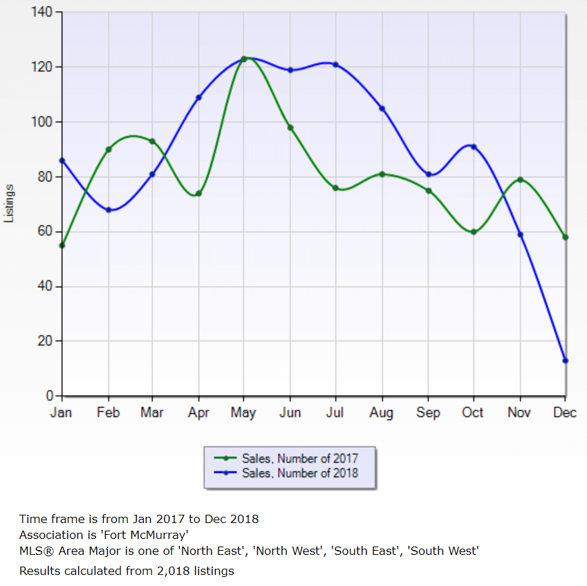 Chart 1: Monthly MLS®️ Sales
Important note: The December 2018 point in all of these charts is month-to-date only, and at the time of writing it is December 10th, so we shouldn’t compare this year’s December figures to last year’s as last year's are for the whole month of December.
So far in 2018, there have been 1,057 transactions vs. 952 in all of 2017. If this December produces a total of 50 sales[efn_note]In all of the charts and tables in this post, data is sourced with the following criteria: All property types without
condo fees that are not vacant lots. The data covers only the following areas: Abasand, Beacon Hill, Dickinsfield, Downtown, Eagle Ridge, Grayling Terrace, Henning Ridge, Parsons North, Prairie Creek, Stonecreek, Thickwood, Timberlea, Waterways and Wood Buffalo[/efn_note], the 2018 total will be 1,092.
This would represent a 15% growth in sales volume year-over-year.
The majority of these sales, as is typical, occurred between April and August. In fact, as you can see in the above chart, that period was particularly busy vis-a-vis 2017. We also had a little run on inventory last Christmas, with foreclosures, in particular, being snapped up (we currently have approximately 40% fewer foreclosures on the market this winter compared to last winter, by the way).
During Christmas 2017 and late spring/early summer 2018, for us agents on the ground, it felt busy at times, and in some price ranges throughout the year, there has not been a ready supply of quality listings.
Sales volumes have dropped significantly in November and December this year compared to last year, and what we hear day-to-day is that is related to decreasing confidence, which in turn is a result of the pipeline capacity issue coming to a head - possibly impacting fundamentals (corporate investment decisions), and certainly impacting the already-frayed nerves of our community.
If I were a guessing man, I’d say that the pipeline bottleneck would temporarily affect local housing market sentiment, more than it would impact long-term fundamentals, as it is an issue that has been priced into housing market expectations for years now and is getting far more media attention these days because of urgency.
2) New Listings
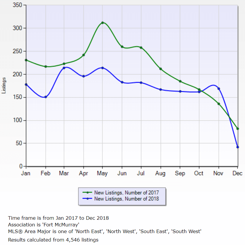 Chart 2: Monthly New MLS®️ Listings
This time last year, we wrote an article called “The 2018 Fort McMurray Real Estate Market”. In it, we pointed out that inventory had started to fall earlier in 2017 than in previous years and that, in large part, was due to the rate of new listings falling significantly in Q3 and Q4 2017. You can see that in the above chart (follow the green line).
The theory was that lower prices were causing homeowners not to sell (or not to be able to sell).
2018 has seen a consistent continuation of that process: In total, there have been 2,445 MLS®️ listings so far this year as opposed to 2,929 last year. At this rate, the reduction in the rate of new listings will be 15%.
In a typical year, of course, we see a rush of new listings from January to July. As you can see this year, however, the rate of new listings was remarkably consistent throughout the year. This makes sense as foreclosures, divorces or job losses make up a higher fraction of listings these days, and so perhaps sellers have less choice as to timing their listing than before (life determines timing instead). It also stands to reason that those sellers might be more motivated to sell their listings as opposed to have them expire (see later).
We have seen how sales and new listings have changed, but what about their interaction?...
The new listings to sales ratio is a measure of how “hot” or “cold” a market is (whether it favours sellers or buyers). The magic ratio for a balanced market is 2 : 1. This assumes that for every two new listings, one of the sellers is motivated to sell at any price and the other will allow their listing to expire.
New listings to sales ratio (2017) = 2,929 : 952
= 3.08 : 1 => Buyer’s Market
New listings to sales ratio (2018, YTD) = 2,445 : 1,057
= 2.31 : 1 => Balanced/Slight Buyer’s Market
This fits our experience as REALTORS®️ this year: For many price ranges and property types, prices have been relatively stable and negotiations haven’t tended to favour buyers as much (more on that later).
3) Expired Listings
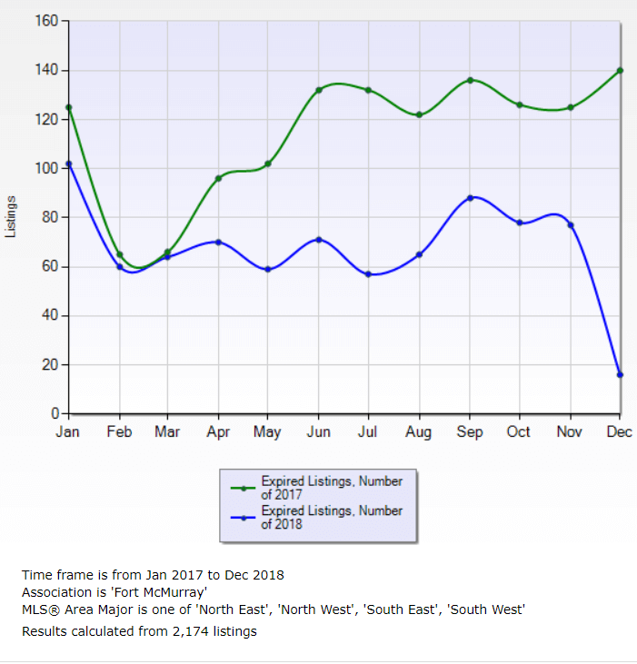 Chart 3: Monthly Expired MLS®️ Listings
In total this year so far, 1,075 MLS®️ listings have expired versus 1,645 in the whole of 2017. This means the rate (over time) at which listings are expiring is down approximately 28%. As mentioned earlier, we suspect that this is because a higher than a normal fraction of listings are being listed by people who need to sell, or at least have a strong want (having waited for some time to move).
Typically, the number of expired listings grows as the year continues, with the majority coming off the market in Q3 and Q4. That was certainly the case in 2017. This year, the number of expired listings has been relatively stable as the year has gone on.
Now that we have information on sales and expiries, we can look at the ratio of the two (sales: expired listings):
For all of 2018, the ratio was: 962:1,362 = 0.7:1
(In 2017, The A-Team’s sales to expiry rate was: 66:17 = 3.9:1)
For 2018 (YTD) the ratio is: 1,057:1075 = 1:1
(For 2018 (YTD) The A-Team’s ratio is: 93:21 = 4.4:1)
1:1 indicates a balanced market, with higher ratios putting negotiation power in the hands of sellers, so as you can see, we have more evidence of a balanced market for the market as a whole (parts of the market are still in a buyer’s market - see later).
4) Inventory (Stock of Active Listings)
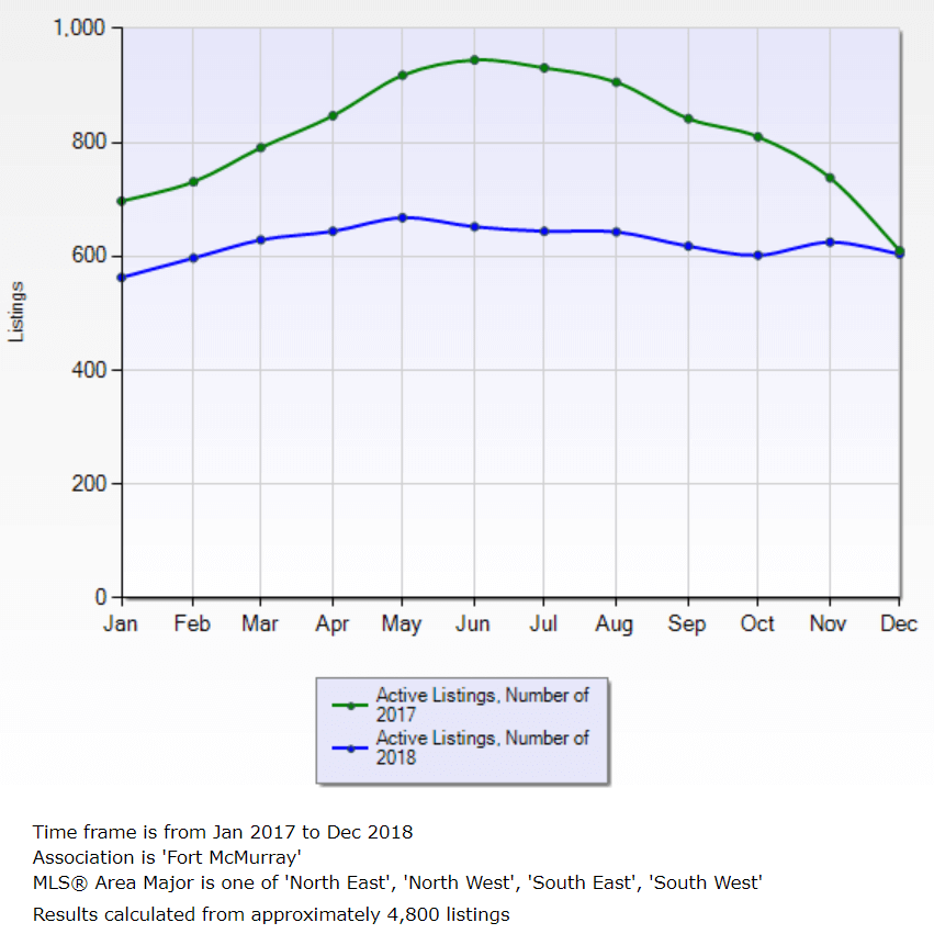 Chart 4: Monthly Active MLS®️ Listings (Inventory)
Today’s inventory figure is almost the exact same as it was twelve months ago to the date, but the preceding year looked very different…
2017 was more similar to what we are used to seeing (during the boom, and the first years of the bust).
In 2014, 2015 and 2016, the number of listings peaked in Sep/Oct at 934, 1,047, and 887 respectively. Last year, inventory peaked in June at 945. This year it peaked early again, but only at 668 listings. The stock of listings, was in fact, incredibly flat throughout the year.
Easily our favourite measure of the market is the absorption rate (months of inventory). It is calculated by dividing the stock of inventory by sales. It can be broken down by property type (see later) as well as by time.
As a guide, for most of 2018, the absorption rate hovered around 10 months of inventory. 5-6 months of inventory is indicative of a balanced market, so 10 months put us firmly in buyer’s market territory.
Let’s calculate the absorption rate for the market as a whole, for each of the months in 2018 so far (we’re taking data from the active listings and the sales charts):
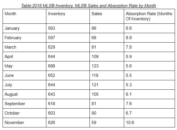
All the way from January through to October, the market was more or less in balance (5-6 months is the magic number). As mentioned earlier in the article, there were times during the busy season when the market felt quite competitive (our listing agents and buyer’s agents were in multiple offers). And towards the fall, it was challenging as a buyer’s agent to find quality listings.
This chart leaves us with a question through: What about November?
Inventory rose between October and November, in part because of weaker sale figures, and in part because of a lot of new multifamily listings coming as projects in Abasand started to be completed. I can tell you that that trend has continued in December and for the same reasons.
Right now, everyone we talk to is asking if we think the pipeline bottleneck is going to impact the market. We’re not allowed to attempt to predict the future so it’s tough to answer. In a way it already has, through lost confidence and sales, but the real question I think people are asking is “will it affect the market over an extended period of time?”...
The big message forming in this blog is that (for most property types, at least), the buyer’s market appears to be behind us - that’s the bigger picture. In my mind, the pipelines bottleneck has been known about by firms and households for some years now, so the fact that it has come to a crescendo, maybe isn’t changing the fundamentals of our housing market (wages, unemployment, interest rates, rents) and it’s more so playing with our emotions.
Intermission!
So far, we have seen strong evidence that the market should be delivering balanced market results. This is because sales are up, new listings are down, as are expiries. We have seen that inventory was fairly flat through the year (which is highly unusual), at there were times during the year, when the months of inventory nudges into seller’s market territory.
The next two charts will look a little bit more at the “results” side. Who have negotiations typically favoured this year, and does it reflect the graphs we have inspected so far? And what about days on market? Have listings sold quicker this year vis-a-vis last year, as you might expect?
At the end, we will take a little look at the distribution of sales by price range in 2018 versus 2017.
5) Discounts
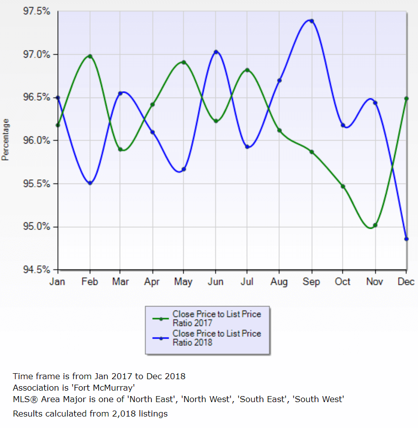 Chart 5: Average Monthly Sale Price to List Price Ratio for Fort McMurray MLS®️ Sales
The sale price to list price ratio is shown above as the percentage of the list price (at time of offer) that the sale price was negotiated at. If you subtract the percentage from 100%, you get the average discount that was negotiated that month.
For example, in June 2018 the ratio was 97%, which means that properties sold for an average discount of 3%.
Both for 2017 and for 2018, the average discounts have been 3.6%, and there’s not been a discernible trend in either direction for each year. It is a bit of a mystery, given the results in the first half of this blog, because that average discount is still in buyer’s market territory. It’s possible that it is a hangover from years gone by - that buyer and seller expectations are lagging behind the reality of, for example, the absorption rate (see earlier). It’s also possible that even though we are in a balanced market, those buyers and sellers acting in the marketplace are not nervous about prices going up, and that the sellers that remain are particularly motivated. This explanation lines up with our day-to-day experience.
6) Days to Sell
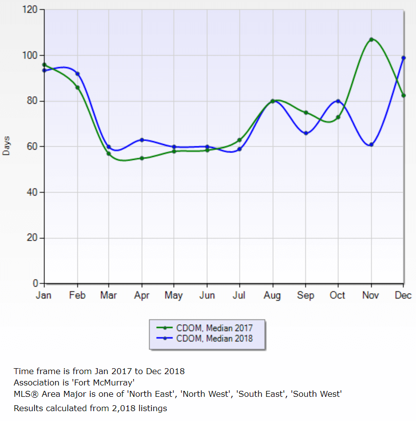 Chart 6: Monthly Median Days to Sell for Sold Fort McMurray MLS®️ Listings
In general, this year’s median days to sell has been very similar to last year’s, and it has followed the same pattern of a slow rising throughout the year, with homes selling with a median days to sell of about 50 days in the spring, and 70 in the winter. This is indicative of a buyer’s market.
7) Distribution
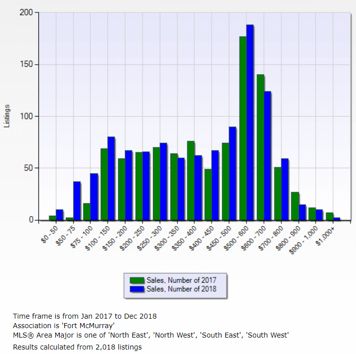 Chart 7: Distribution of MLS®️ Sales By Price Range
There has been very little change in the distribution of sales between 2017 and 2018 YTD between $100,000 and $800,000. In each of the three highest price tranches above that, there have been fewer sales, whereas, in each of the lower price ranges below it, there has been growth in sales volumes.
A Look Ahead at 2019 - The Devil is in The Detail
All of the charts in this blog lump the different property types together and it’s important not to draw the conclusion that because the market, in aggregate, appears balanced (or balancing), that different parts of the market aren’t behaving in different ways.
For example: What about condos?
What about luxury homes?
I’m pretty excited to write our next article over the holidays. It will look ahead at the 2019 real estate market in Fort McMurray and highlight some themes to look out for. We’ll also dive a little deeper to see how different segments of the market are behaving right now, as we cross into the new year. AND, we’ll take a good look at how prices of different types of properties have compared this year versus 2017: What they have been doing in 2018 and what they are doing right now...
...It’ll be an essential read for anyone thinking of buying or selling in the next little while (follow the blog so as not to miss it).
Please have a lovely Christmas time; enjoy lots of cake for me, as I find myself on a diet.
If you’d like advice specific to you, please contact us so we can assign a specialist buyer’s agent or listing agent to help inform you so that you can make the best decisions for you & yours.
Thank you for reading: If you have found this article informative, please share it :)